Brand New UX Dashboard
By Browsi | April 18, 2022
For the first time ever, uncover how your monetization strategy directly impacts your UX and find the perfect UX/Revenue balance.
You can now see in one slick dashboard how your UX KPIs and your Revenue KPIs correlate. No more shooting in the dark and upsetting your Editorial team, ensure that every ad-related decision also improves your UX.
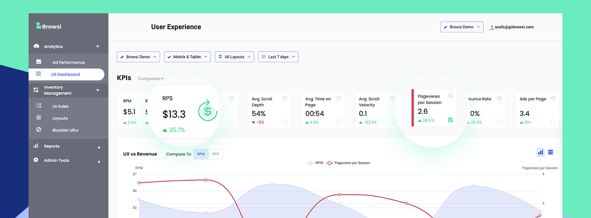
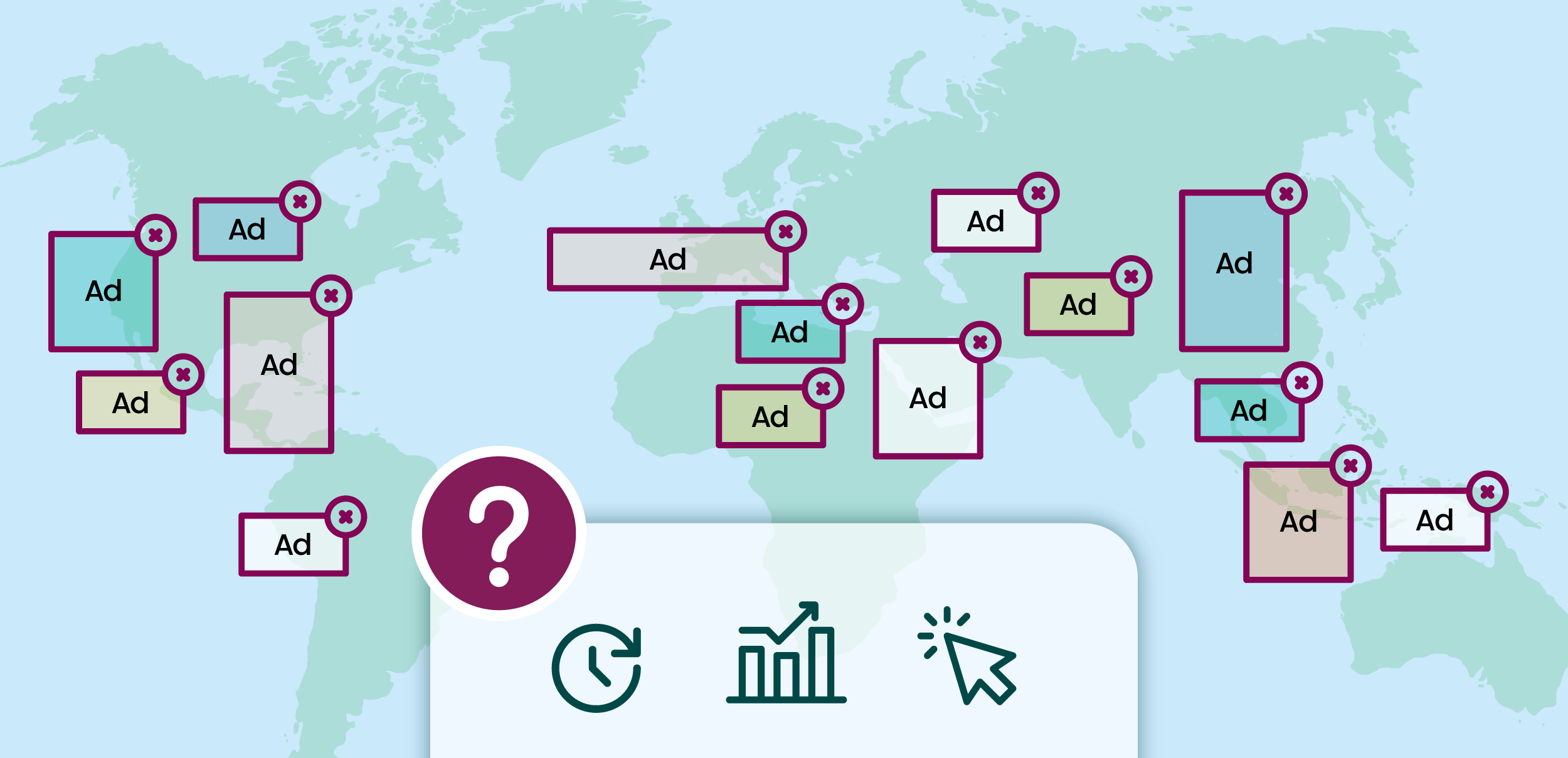
 Track your UX and Revenue KPIs
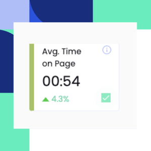
Monitor all your UX metrics such as pageviews per session, average scroll depth, average time on page and see their correlation with your RPM and RPS.
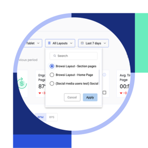 Analyze your UX per individual layout
Understand how each of your different ad layouts affect the users’ behaviors AND your revenue to adapt your monetization strategy accordingly.
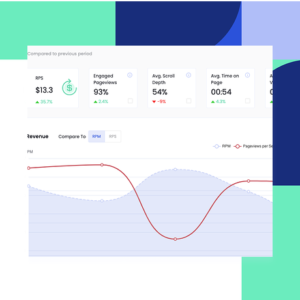 Find your UX/Revenue sweet spot
Pinpoint the perfect UX/Revenue balance and never settle again for less revenue to protect your UX or for bad UX to grow your revenue!
Tired of having no visibility into how your ad layout impacts your UX?
Schedule your demo now and we’ll be more than happy to show you our new UX dashboard and how you can get the best of both worlds, increased revenue AND improved UX.
Latest Articles
-

The Web’s Closing Doors – And AI’s Feeling the Lock
Recently, Cloudflare took the unusual step of publicly calling out Perplexity AI for scraping publisher content without permission. And they didn’t hold back - accusing the company of disguising its crawler, bypassing robots.txt rules, and consuming massive bandwidth without attribution or consent. Cue the familiar debate: who owns online content? Should AI assistants be allowed to “learn” from everything on the web? Is scraping theft - or fair use?
View Now -
We Now Know What Ad Was Served. We Still Don’t Know if it Mattered.
The IAB’s new ACIF standard brings much-needed structure to creative asset tracking in programmatic advertising. It’s a meaningful step — but knowing what was served isn’t the same as knowing if it mattered. This piece explores what ACIF fixes, what it doesn’t, and why understanding the experience of an ad is key to measuring true impact.
View Now -

When Budgets Shrink, Transparency Becomes Power
Today’s media teams aren’t just asked to drive results; they’re asked to defend them. In a market where ad budgets are under the microscope and every dollar must prove its worth, clarity and efficiency win. It’s no longer about spending more — it’s about spending smarter. The brands that can surface waste, double down on what works, and adapt in real time will be the ones that thrive in this new media economy.
View Now