Brand New UX Dashboard
By Browsi | April 18, 2022
For the first time ever, uncover how your monetization strategy directly impacts your UX and find the perfect UX/Revenue balance.
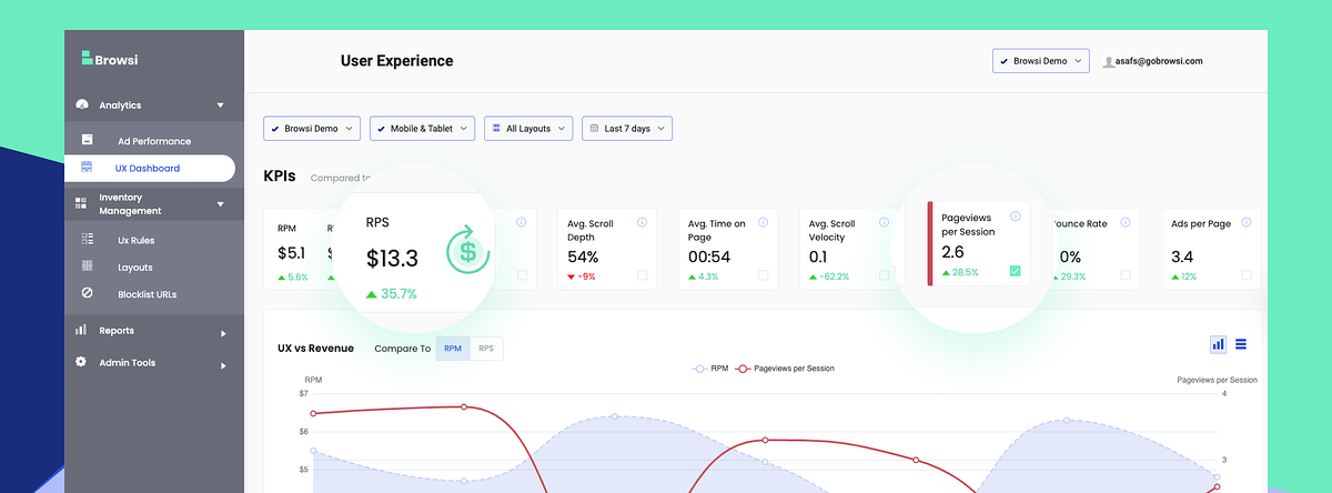
You can now see in one slick dashboard how your UX KPIs and your Revenue KPIs correlate. No more shooting in the dark and upsetting your Editorial team, ensure that every ad-related decision also improves your UX.
 Track your UX and Revenue KPIs
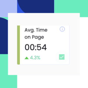
Monitor all your UX metrics such as pageviews per session, average scroll depth, average time on page and see their correlation with your RPM and RPS.
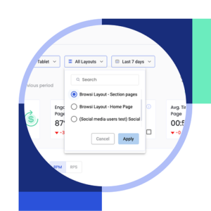 Analyze your UX per individual layout
Understand how each of your different ad layouts affect the users’ behaviors AND your revenue to adapt your monetization strategy accordingly.
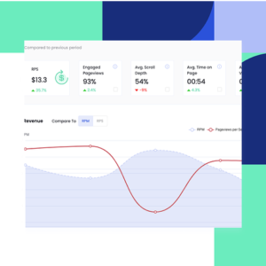 Find your UX/Revenue sweet spot
Pinpoint the perfect UX/Revenue balance and never settle again for less revenue to protect your UX or for bad UX to grow your revenue!
Tired of having no visibility into how your ad layout impacts your UX?
Schedule your demo now and we’ll be more than happy to show you our new UX dashboard and how you can get the best of both worlds, increased revenue AND improved UX.
Latest Articles
-

How Accurate is Browsi’s Data? Tried and Tested.
Most marketers trust competitive spend data without questioning where the numbers come from. We tested PolarisAI Engine™ against the only benchmark that matters: what advertisers actually reported in their earnings calls. The result was an 87% correlation across five major brands, revealing the difference between data that looks confident and data grounded in reality.
View Now -
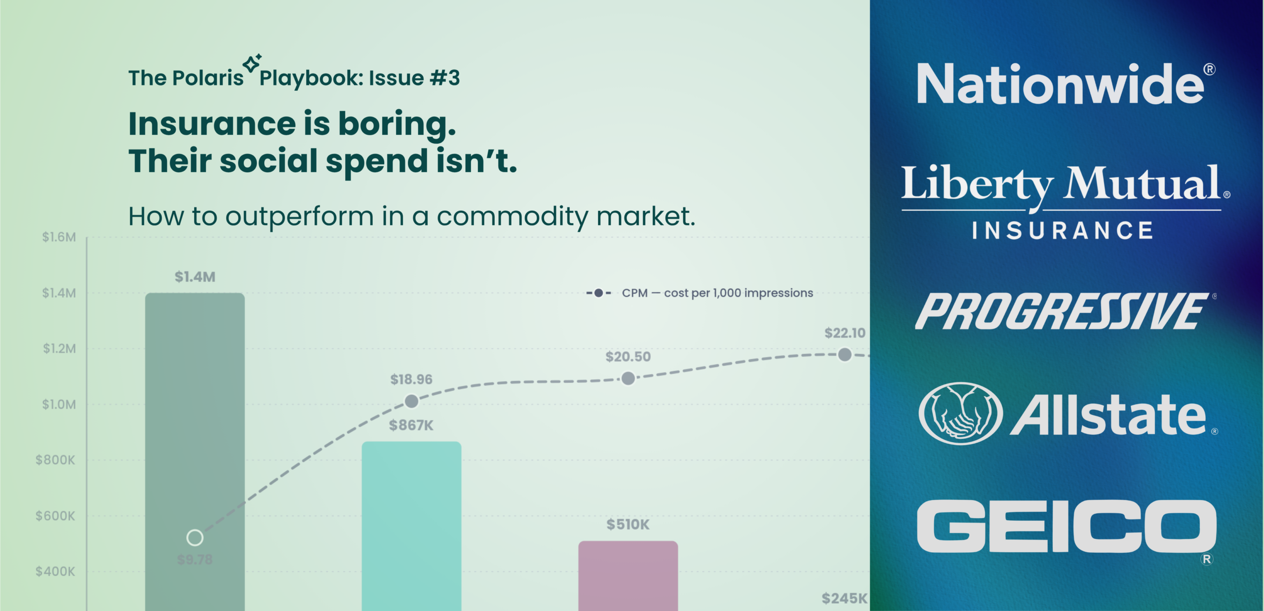
Insurance is Boring. Their Social Spend Isn’t.
Insurance products may look the same, but advertising performance doesn’t. In this edition of the Polaris Playbook, we analyze how Progressive, GEICO, Allstate, Liberty Mutual, and Nationwide allocate social ad spend — and uncover why Progressive’s CPM is more than 50% lower than competitors despite being the category’s biggest spender. The data reveals a broader competitive advantage hidden inside the auction itself.
View Now -
Most brands think they are data driven. They’re not.
In this breakdown, we use PolarisAI to compare American Express and PayPal, uncovering how PayPal achieved comparable performance with dramatically lower spend through smarter targeting, simpler messaging, and more efficient execution.
View Now