Your Layouts Comparison Dashboard!
By Browsi | August 18, 2022
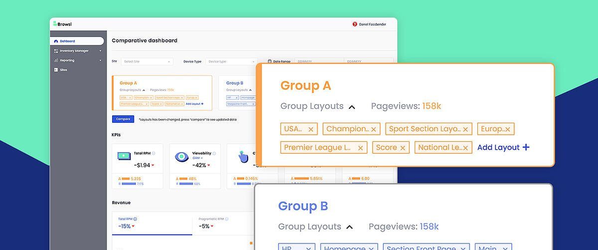
Create 2 groups of ANY of your layouts and compare their performance.
Does your sports section layout outperforms your home page layout in terms of Viewability, RPM or CTR? Compare, monitor and optimize accordingly!
Publishers can now customize their ad serving strategy by comparing between layouts and see the results in our new layouts comparison dashboard, then decide which ad layout is best for higher RPM, viewability, CTR and more!
 Compare layouts groups from different site sections
Find out which layouts group produces higher RPM while keeping viewability and CTR at your desired level and optimize accordingly.
 Discover which ad sizes increase your performance
See which one of your ad sizes variation yields more ads per page and higher viewability.
 Reveal how new ad types affect your KPIs
Test how layout groups with additional ad types, from inline to adhesive, bottom and top ads can affect your revenue, viewability, fill rate and IVT.
Did we manage to grab your attention? Let’s schedule a 15-min call and evaluate how comparing between different layout groups can help you grow your revenue and improve your UX. Because that’s exactly what we do.
Latest Articles
-
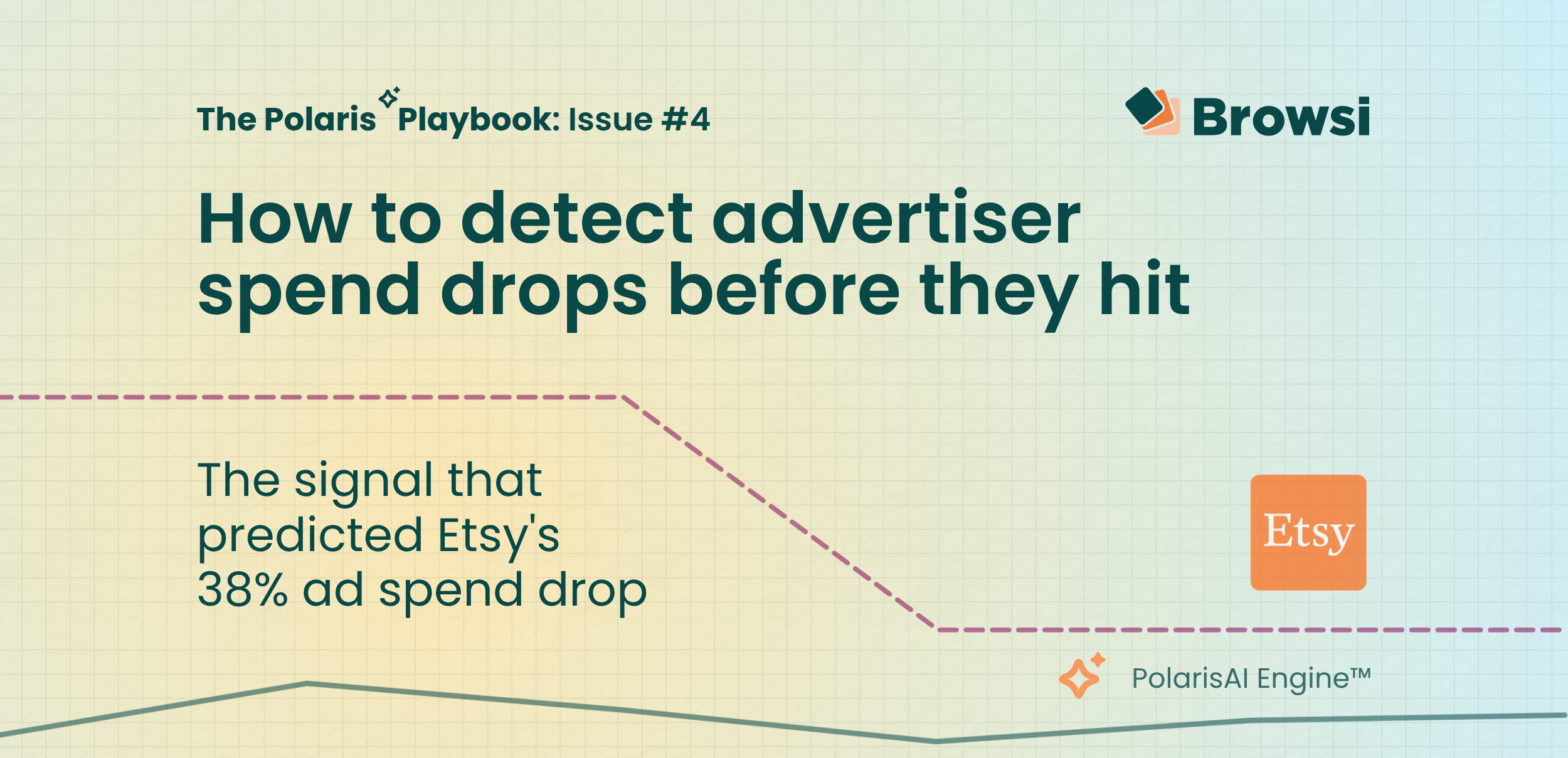
How to Detect Advertiser Spend Drops Before They Hit
Etsy's earnings confirmed what PolarisAI had already seen: a major pullback in marketing investment. By analyzing competitive signals before quarterly results were released, PolarisAI projected a 38% decline in spend while the market was still reacting to the underlying changes. The result highlights a growing reality for marketers: the most valuable competitive insights often emerge long before earnings calls explain them.
View Now -

How Accurate is Browsi’s Data? Tried and Tested.
Most marketers trust competitive spend data without questioning where the numbers come from. We tested PolarisAI Engine™ against the only benchmark that matters: what advertisers actually reported in their earnings calls. The result was an 87% correlation across five major brands, revealing the difference between data that looks confident and data grounded in reality.
View Now -
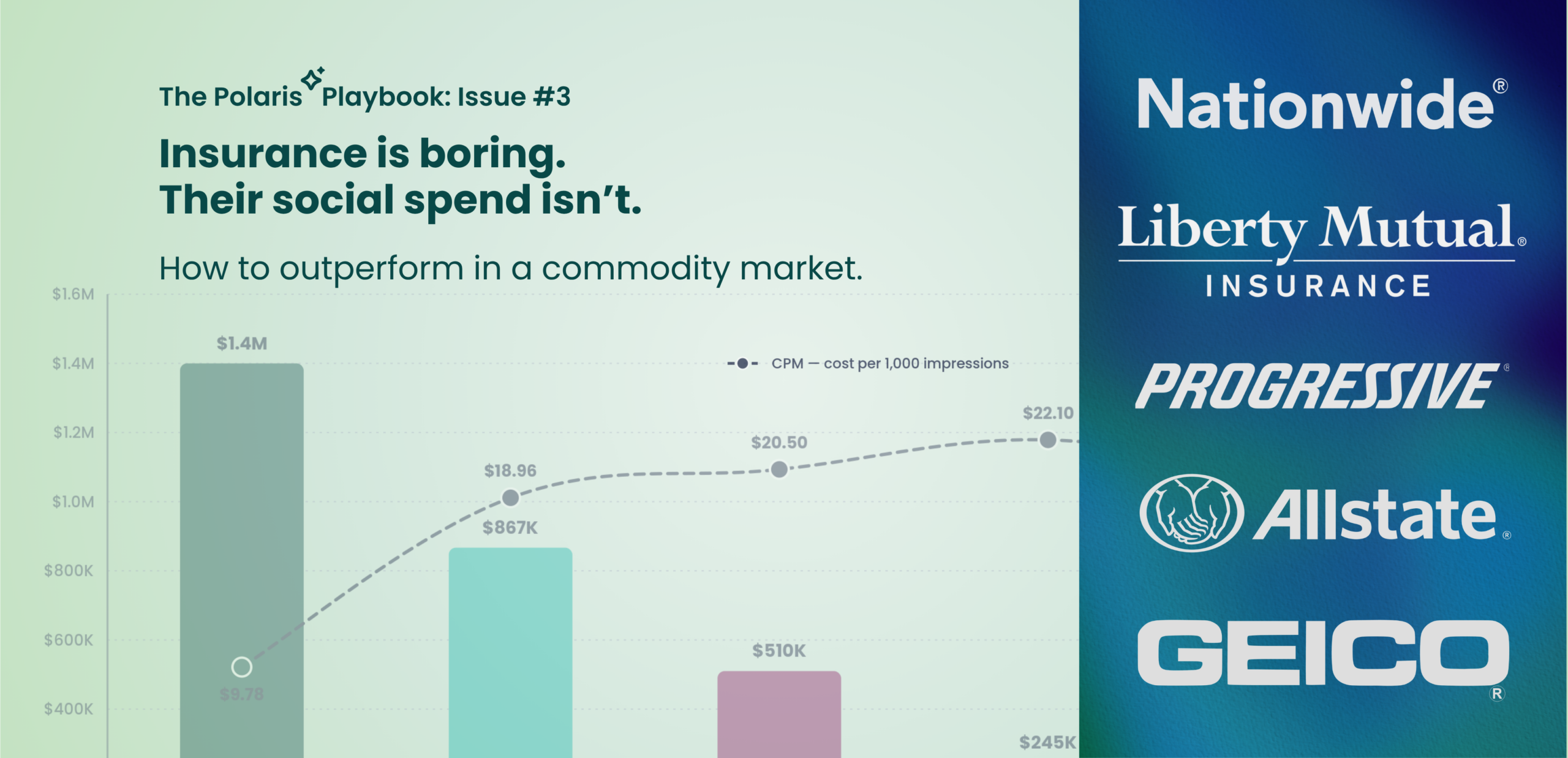
Insurance is Boring. Their Social Spend Isn’t.
Insurance products may look the same, but advertising performance doesn’t. In this edition of the Polaris Playbook, we analyze how Progressive, GEICO, Allstate, Liberty Mutual, and Nationwide allocate social ad spend — and uncover why Progressive’s CPM is more than 50% lower than competitors despite being the category’s biggest spender. The data reveals a broader competitive advantage hidden inside the auction itself.
View Now